Understanding Yield Curves in DeFi Financial Modeling
Introduction to Yield Curves in DeFi
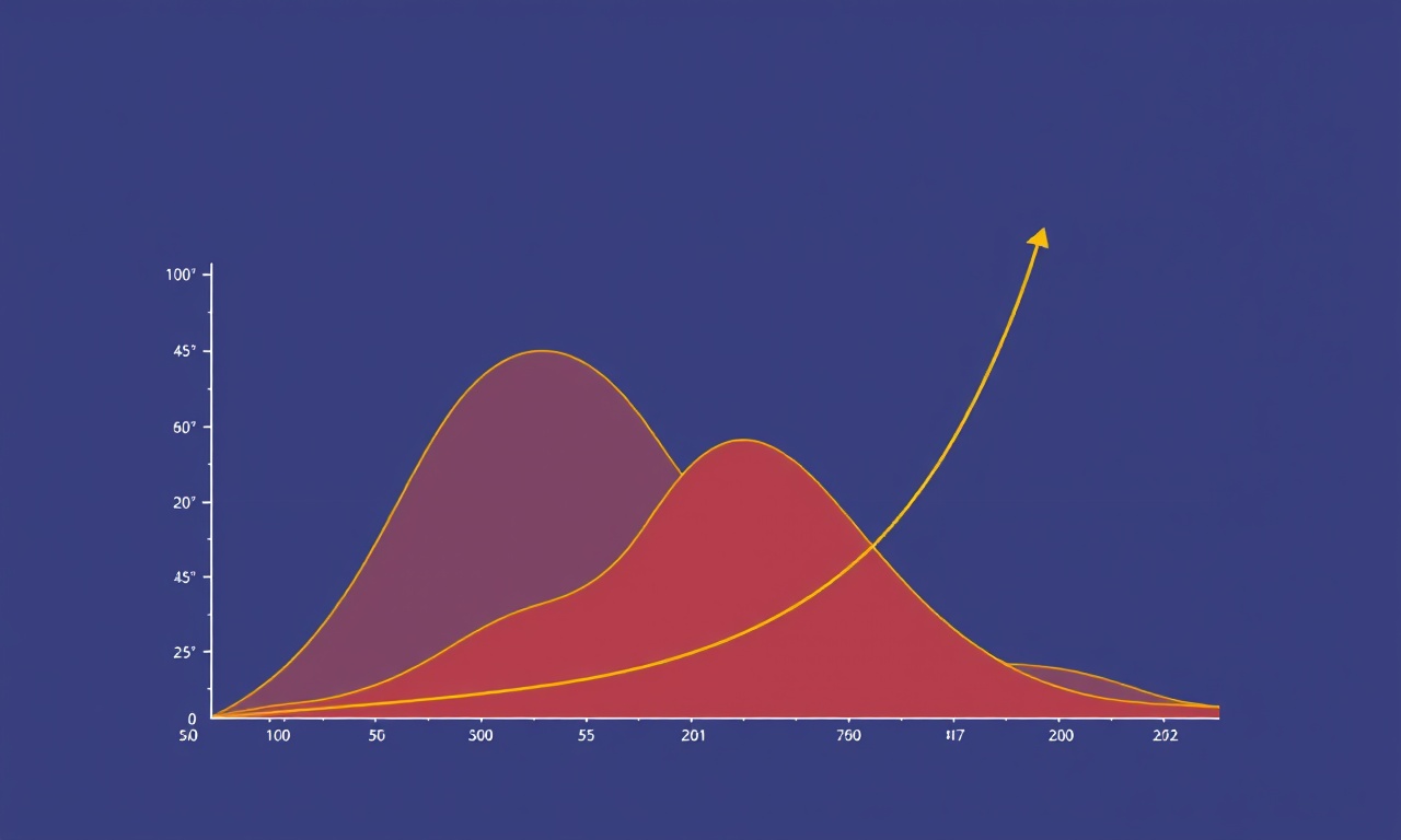
Yield curves are the backbone of risk‑adjusted return analysis in any sophisticated financial model. In traditional finance they represent the relationship between bond maturities and their corresponding yields, giving investors insight into expected returns over time and the term structure of risk. In the decentralized finance ecosystem, yield curves take on a new form: they map the yields available on lending protocols, liquidity pools, and synthetic asset platforms across different time horizons or collateral classes. Understanding these curves is essential for building robust DeFi models that can forecast performance, assess risk, and guide capital allocation decisions.
Yield curves in DeFi are not static; they evolve with market liquidity, protocol incentives, and macro‑economic signals such as on‑chain governance outcomes. This article dives into the definition, construction, and practical usage of yield curves in decentralized financial modeling. We’ll cover the core concepts, data requirements, mathematical representations, and common pitfalls that modelers should avoid.
What Is a Yield Curve?
At its simplest, a yield curve shows how expected returns change as the investment horizon lengthens. In a DeFi context this could mean:
- Time‑based yields: the return you can lock for 1 day, 1 week, 1 month, or 1 year on a particular protocol.
- Collateral‑based yields: the return you can obtain on different assets such as ETH, USDC, or a synthetic token.
- Protocol‑based yields: the return offered by multiple lending protocols for the same underlying asset.
Unlike fixed‑income securities, DeFi yields are often highly variable, governed by supply‑demand dynamics, protocol rewards, and market sentiment. Consequently, a DeFi yield curve is more like a moving snapshot rather than a single static curve.
A well‑constructed yield curve enables modelers to:
- Compare the attractiveness of different protocols or assets.
- Estimate the risk of holding a position over a given horizon.
- Perform arbitrage detection between protocols or between on‑chain and off‑chain markets.
- Project future cash flows for budgeting and financial planning.
Data Foundations
To build a yield curve you need accurate, high‑frequency data from the DeFi ecosystem. Key data sources include:
- On‑chain analytics: smart‑contract calls that expose reserves, interest rates, and incentive payouts. For example, the
reserveDataview in Compound or thetotalBorrowRatePerSecondin Aave. - Oracles: price feeds that allow you to convert yields into USD terms and to assess collateral values.
- Protocol APIs: many protocols provide REST or GraphQL endpoints to expose historical rates and incentive schedules.
- Community dashboards: sites like DeFi Pulse or Yieldwatch aggregate real‑time yield information across many protocols.
The data must be cleaned to remove anomalies such as flash loan spikes or re‑entrancy attacks that temporarily distort rates. Additionally, normalizing yields to a common metric—usually annualized percent yield (APY)—is essential for cross‑protocol comparison.
Constructing a Time‑Based Yield Curve
A time‑based yield curve displays the relationship between the maturity of a DeFi position and the yield it offers. Here’s a step‑by‑step guide to building one:
1. Identify the Yield Sources
Select the protocols that provide yield for a specific asset (e.g., USDC). For each protocol, pull the current and historical APY data.
2. Align Time Horizons
Decide on discrete horizons that make sense for your model. Common choices are 1 day, 7 days, 30 days, 90 days, and 365 days. For protocols that offer lock‑up periods, these horizons align naturally with the available lock durations.
3. Interpolate Between Data Points
Many protocols provide only a handful of lock‑up options. Use linear interpolation or spline techniques to estimate yields for intermediate horizons. For example, if a protocol offers 30‑day and 90‑day rates, interpolate the 60‑day yield assuming a linear path.
4. Normalize Yields
Express all rates as annualized yields using the standard formula:
[ APY = \left(1 + \frac{r}{n}\right)^n - 1 ]
where (r) is the simple rate for the period and (n) is the number of compounding periods per year. This ensures comparability across protocols with different compounding frequencies.
5. Plot the Curve
Using a charting library or spreadsheet, plot the interpolated yields against the selected horizons. The resulting curve typically slopes upward, indicating higher yields for longer lock‑up periods, though outliers may occur due to protocol incentives.
Constructing a Collateral‑Based Yield Curve
When comparing yields across assets, a collateral‑based yield curve can be invaluable. This curve plots the APY offered on each asset for a fixed horizon, such as 30 days. The steps are analogous to the time‑based curve, but you replace the horizon variable with the asset variable.
Steps:
- Collect Data: For a chosen horizon, gather APYs for each asset across all relevant protocols.
- Normalize: Convert yields to USD terms using oracle prices.
- Filter: Remove assets with insufficient liquidity or extreme volatility.
- Rank: Order assets by yield to highlight the most attractive collateral.
- Interpret: Higher yields often accompany higher risk, such as lower liquidity or volatile price.
This curve is particularly useful for risk‑averse investors who wish to understand which collateral types offer the best risk‑adjusted returns.
Modeling the Yield Curve Dynamics
DeFi yield curves are dynamic. Sudden protocol upgrades, governance votes, or macro‑economic shocks can shift yields dramatically. To model these dynamics:
1. Time‑Series Analysis
Apply ARIMA or GARCH models to historical yield data to capture autocorrelation and volatility clustering. This helps forecast short‑term yield movements.
2. Scenario Analysis
Simulate extreme events such as a protocol hack or a liquidity crisis. Vary parameters such as reward multipliers, collateral factor adjustments, or price feed outages to see how the curve shifts.
3. Monte Carlo Simulation
Generate random yield paths based on statistical distributions derived from historical data. This allows you to compute Value‑At‑Risk (VaR) for a portfolio of DeFi positions.
4. Sensitivity Testing
Adjust key variables—reserve levels, incentive yields, or collateral ratios—to observe the sensitivity of the curve. Identify which protocol metrics drive yield changes most strongly.
Integrating Yield Curves into Financial Models
Once you have a yield curve, the next step is to embed it into broader financial models. Here are several applications:
Portfolio Allocation
Use the curve to allocate capital across protocols and assets. For example, you might allocate 30% to the highest‑yielding 30‑day position, 20% to a medium‑risk 90‑day lock, and 50% to a stable, low‑yield, liquid position.
Cost of Capital Estimation
For projects that require funding, model the cost of capital by interpolating the yield curve at the maturity that matches the project’s cash‑flow profile.
Risk‑Adjusted Return Metrics
Calculate Sharpe or Sortino ratios by subtracting the DeFi risk‑free rate (e.g., stablecoin yield) from the curve’s yield and dividing by the standard deviation of yield changes.
Arbitrage Opportunity Detection
Compare the yield curves of a pair of protocols offering the same collateral. Any cross‑sectional differences beyond the cost of transferring funds may signal an arbitrage opportunity.
Common Pitfalls and How to Avoid Them
| Pitfall | Why It Happens | Mitigation |
|---|---|---|
| Using raw on‑chain rates without annualization | APYs differ by compounding frequency | Convert all yields to APY before comparison |
| Ignoring liquidity constraints | High yields may come with low liquidity, increasing slippage | Incorporate liquidity depth into risk assessment |
| Relying on a single protocol’s data | Protocol bugs or governance changes can distort rates | Cross‑validate across multiple protocols |
| Overfitting time‑series models | Historical patterns may not hold in volatile markets | Use robust validation techniques and stress tests |
| Failing to adjust for price volatility | Collateral value changes affect real returns | Convert yields to USD terms using real‑time price feeds |
Practical Example: Yield Curve for USDC on Three Protocols
Below is a simplified illustration of how you might construct a yield curve for USDC across three major protocols: Aave, Compound, and Yearn. All data are annualized.
| Horizon | Aave APY | Compound APY | Yearn APY |
|---|---|---|---|
| 1 day | 5.00% | 4.80% | 6.10% |
| 7 days | 5.20% | 5.00% | 6.30% |
| 30 days | 5.50% | 5.30% | 6.60% |
| 90 days | 5.80% | 5.70% | 6.90% |
| 365 days | 6.00% | 5.90% | 7.00% |
Using this table, you can compute the implied yield differential between protocols and decide which platform offers the best risk‑adjusted return for a given horizon. Notice how Yearn consistently leads, likely due to its aggregation strategy, but also watch for potential liquidity risk.
Advanced Topics
1. Yield Curve Smoothing with Machine Learning
Neural networks can learn complex patterns in yield curves, capturing nonlinear relationships between protocol features and yields. Recurrent neural networks (RNNs) or transformers can model temporal dependencies, while convolutional neural networks (CNNs) can extract patterns from cross‑protocol data matrices.
2. Stochastic Control for Dynamic Yield Allocation
When managing a multi‑protocol vault, you can use stochastic control techniques to optimize yield over time. The control problem involves deciding when to rebalance between protocols given forecasted yield curves and transaction costs.
3. Decentralized Governance Impact
Protocol governance decisions—such as altering collateral factors or introducing new incentive tokens—can cause abrupt shifts in the yield curve. Incorporating governance voting data into predictive models can improve forecast accuracy.
4. Regulatory Considerations
While DeFi is largely unregulated, potential future regulatory changes may affect yields by imposing capital requirements or taxes. Scenario analysis can incorporate these potential shifts.
Putting It All Together: A Model Blueprint
-
Data Ingestion Layer
Pull real‑time on‑chain data, price feeds, and protocol APIs. -
Cleaning & Normalization
Remove outliers, compute APY, and align horizons. -
Yield Curve Construction
Build both time‑based and collateral‑based curves with interpolation. -
Dynamic Forecasting Engine
Apply time‑series models, Monte Carlo simulation, or ML techniques. -
Risk Metrics Module
Compute VaR, Sharpe, and liquidity risk scores. -
Decision Engine
Generate allocation recommendations and arbitrage alerts. -
Reporting Dashboard
Visualize curves, risk metrics, and portfolio performance in real time.
Conclusion
Yield curves are more than just a visual representation of returns; they encapsulate the complex interplay of supply, demand, incentives, and risk within the DeFi ecosystem. By systematically collecting data, normalizing yields, constructing robust curves, and integrating them into dynamic financial models, practitioners can make informed decisions that balance opportunity with prudence.
The decentralized landscape is evolving rapidly, and yield curves will continue to adapt as protocols innovate and new financial primitives emerge. Staying fluent in the language of yield curves will empower analysts, developers, and investors to navigate this dynamic space with confidence and precision.

.png)
Emma Varela
Emma is a financial engineer and blockchain researcher specializing in decentralized market models. With years of experience in DeFi protocol design, she writes about token economics, governance systems, and the evolving dynamics of on-chain liquidity.
Discussion (10)
Join the Discussion
Your comment has been submitted for moderation.
Random Posts

Unlocking DeFi Fundamentals Automated Market Makers and Loss Prevention Techniques
Discover how AMMs drive DeFi liquidity and learn smart tactics to guard against losses.
8 months ago

From Primitives to Vaults A Comprehensive Guide to DeFi Tokens
Explore how DeFi tokens transform simple primitives liquidity pools, staking, derivatives into powerful vaults for yield, governance, and collateral. Unpack standards, build complex products from basics.
7 months ago

Mastering Volatility Skew and Smile Dynamics in DeFi Financial Mathematics
Learn how volatility skew and smile shape DeFi options, driving pricing accuracy, risk control, and liquidity incentives. Master these dynamics to optimize trading and protocol design.
7 months ago

Advanced DeFi Lending Modelling Reveals Health Factor Tactics
Explore how advanced DeFi lending models uncover hidden health-factor tactics, showing that keeping collateral healthy is a garden, not a tick-tock, and the key to sustainable borrowing.
4 months ago

Deep Dive into MEV and Protocol Integration in Advanced DeFi Projects
Explore how MEV reshapes DeFi, from arbitrage to liquidation to front running, and why integrating protocols matters to reduce risk and improve efficiency.
8 months ago
Latest Posts

Foundations Of DeFi Core Primitives And Governance Models
Smart contracts are DeFi’s nervous system: deterministic, immutable, transparent. Governance models let protocols evolve autonomously without central authority.
2 days ago

Deep Dive Into L2 Scaling For DeFi And The Cost Of ZK Rollup Proof Generation
Learn how Layer-2, especially ZK rollups, boosts DeFi with faster, cheaper transactions and uncovering the real cost of generating zk proofs.
2 days ago

Modeling Interest Rates in Decentralized Finance
Discover how DeFi protocols set dynamic interest rates using supply-demand curves, optimize yields, and shield against liquidations, essential insights for developers and liquidity providers.
2 days ago